
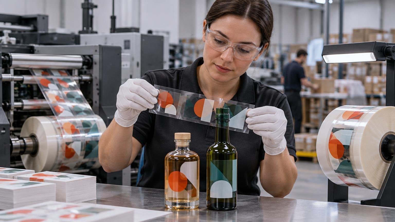
White Ink on Clear Labels: Why It Changes Both Color and Readability
TLDR: White ink clear labels use an opaque white printed layer either as visible artwork or underneath selected colors. The white blocks the package or product color from showing through, improving contrast and making overprinted colors more predictable. Use selective white when some areas should stay transparent, or a broader white flood when most of the design needs an opaque foundation. Before ordering, define the white areas in the artwork and confirm the film, adhesive, container, exposure conditions, application method, and proofing process.
A clear label does not behave like white paper. Any area printed without an opaque backing remains influenced by whatever sits behind it: amber glass, green plastic, a dark liquid, metallic packaging, or even the shadow created by an empty portion of a bottle. That interaction is the central issue when specifying white ink clear labels.
White ink solves the problem selectively. It can appear as the visible white portion of a design, sit beneath process colors as a white underbase, or cover most of the printed area as a flood. Unprinted portions can still preserve the transparent, no-label appearance that made clear film attractive in the first place.
What white ink changes on a clear label
Standard process colors are not usually intended to create an opaque wall. On transparent film, light passes through the printed color and interacts with the container or product behind it. A yellow graphic may shift toward green on a blue bottle. Fine black text over a dark liquid can lose contrast. A photograph can look flatter or less saturated than the same image printed on white stock.
An opaque white layer reduces that interaction. It gives selected colors a lighter, more neutral foundation and can also create white lettering that would otherwise be impossible with CMYK alone. HP describes its Premium White ink as a highly opaque ink intended to produce bright white and vibrant colors on clear media. It also notes that achieving the target opacity with fewer white hits can improve production efficiency.
White ink is therefore more than a decorative upgrade. It is a tool for controlling opacity, contrast, and the degree to which the package becomes part of the design.
White-only, spot white, and white flood compared
| White-ink approach | How it works | Best fit | Main tradeoff |
|---|---|---|---|
| White-only artwork | White ink itself creates text, lines, logos, or illustrations on the clear film. | Minimal designs on dark or colored containers. | Very fine details depend on the printer’s white-ink resolution, registration, and production limits. |
| Selective spot white | White is printed only beneath chosen CMYK elements or in designated white areas. | Designs that combine opaque graphics with transparent windows. | Artwork and press registration require careful control. |
| Broad white flood | A white field sits behind most or all of the colored artwork. | Designs needing a largely consistent, white-backed appearance. | It reduces the transparent effect and may use more white ink than a selective treatment. |
| No white ink | Colors print directly on clear material. | Deliberately translucent graphics or applications on a very light, consistent background. | Color and readability can change substantially with the container and contents. |
Spot white is usually the most flexible choice when the purpose of clear film is to reveal the package. A logo, product name, barcode area, or small illustration can receive a white underbase while a window remains transparent. A white flood is more appropriate when nearly all of the design should resemble printing on white stock but the clear edge or a few transparent areas still matter.
The flood does not have to cover the entire physical label. It can stop short of a clear border or reverse out selected windows. The critical step is making the boundary between opaque and transparent areas intentional rather than leaving it to production interpretation.
When does a clear label need a white underbase?
Use a white underbase when selected graphics must hold their contrast despite changes in the container, fill level, viewing angle, or background. It is especially useful for light process colors, small text, photographs, brand colors, and machine-readable elements that need a controlled background.
White may be unnecessary when transparency is the desired effect. Tint-like graphics, subtle patterns, and windows can work well without it. A light or white container can also serve as a practical background, although the result should still be checked on the actual package rather than assumed from a screen proof.
- Choose spot white when only logos, text, photographs, or critical color areas need opacity.
- Choose a broader white flood when most artwork should be isolated from the container color.
- Leave deliberate clear zones unprinted by white or CMYK if the product must remain visible.
- Consider an opaque white label stock instead if very little of the finished design needs transparency. It may simplify artwork and production.
For projects moving from concept to purchase, suppliers of custom stickers may offer clear formats, but availability alone does not establish the right construction. The quote should identify whether white ink is supported, how it is priced, and what proof will show the opacity treatment.
Why screen artwork cannot predict the final color by itself
A design application normally displays artwork as if it were viewed on a bright, opaque screen. The final clear label may instead be viewed through transparent film, adhesive, glass or plastic, and a colored product. Those layers change the optical result.
Compare at least two physical concepts: CMYK printed directly on clear material and the same CMYK elements printed over white. Place both on the intended package, fill the package if the contents affect appearance, and inspect it under the lighting where customers will see it. A flat proof on white backing cannot fully demonstrate the direct-on-clear version.
Color expectations should also account for the normal difference between illuminated screens and reflective print. The broader guide to choosing sticker colors that print accurately explains why displayed and printed color diverge even before transparent material is introduced.
Set up the white layer deliberately
White ink commonly needs its own spot-color object or production separation. The printer’s workflow uses that information to determine where white is printed and whether it sits beneath or above another color. Xeikon describes workflow tools that can automatically generate white beneath existing artwork, illustrating that white-layer creation may happen either in the submitted file or in production software.
Do not assume every printer wants the same file construction. Before preparing final art, request the provider’s instructions for spot-color naming, layer order, overprint behavior, transparency effects, trapping, minimum line weight, and minimum type size. The general file-preparation principles in this print-ready artwork guide can help prevent missing fonts, poor image resolution, and incorrect bleed, but white separations still require provider-specific directions.
- Mark every area that should print as visible white.
- Identify every CMYK element that needs white beneath it.
- Keep intended transparent windows free from both white and unwanted color objects.
- Confirm whether the white plate should be the same size as the color above it or adjusted to reduce visible registration edges.
- Request a separation preview showing white, color, and clear zones independently.
- Approve a proof that represents the actual container color or review a physical sample on the intended package.
That fourth step should be handled by the printer’s workflow rather than guessed. A white shape extending beyond a colored object can create a visible halo; a white shape that sits too far inside can allow the package color to appear at the edge. The correct adjustment depends on press registration and the design.
Material and container fit matter as much as the ink
White ink cannot correct a film or adhesive mismatch. A clear-label specification should begin with the container and application conditions: glass or plastic, smooth or textured, rigid or squeezable, dry or damp, flat or tightly curved. Also disclose whether labels are applied by hand or machine and whether application occurs at room temperature or in a chilled environment.
Clear films are often selected for their transparency and resistance to incidental moisture, but performance belongs to the complete construction: face film, top coating, ink, protective finish, adhesive, liner, container surface, and application process. It is not responsible to call an unspecified clear label waterproof, freezer-safe, chemical-resistant, or outdoor-rated.
A specific Avery Dennison clear polypropylene construction data sheet, for example, lists a clear permanent acrylic adhesive, a 5°C minimum application temperature, and a stated service range of −40°C to 80°C subject to facestock limitations. It also reports maintained clarity through 72 hours of ice-water exposure. Those values apply to that documented construction, not to clear labels generally.
The same document cautions that the relatively rigid polypropylene film requires care on non-uniform or highly squeezable surfaces. A film that looks excellent on a straight glass bottle may lift, wrinkle, or bridge when wrapped around a flexible bottle or compound curve. A sample applied to the actual container is more informative than a material name alone.
Moisture, refrigeration, abrasion, and outdoor exposure
Start with the real exposure sequence. A beverage label might be applied to a dry bottle, stored in refrigeration, placed in melting ice, handled with wet hands, and then rubbed during transport. A cosmetic label may encounter oils, surfactants, and repeated squeezing. An industrial label may face cleaning chemicals, sunlight, heat, or abrasion.
Each sequence can require a different combination of adhesive, face film, ink system, and laminate or varnish. Moisture resistance at the face of the label does not prove that the adhesive will bond to a wet, cold, textured, or contaminated container. Likewise, an adhesive’s service-temperature range does not establish that it can be applied successfully at the lowest service temperature.
- State the container material and identify any recycled content, coatings, mold-release residue, texture, or surface treatment that could affect bonding.
- Separate application temperature from later storage and service temperatures.
- List exposure to water, ice, oils, alcohol, cleaners, chemicals, abrasion, and sunlight.
- Specify how long the label must remain legible and attached.
- Ask whether a laminate or varnish is needed to protect the printed surface.
- Test finished, converted labels on production containers under a representative exposure cycle.
For an everyday example of how spills and handling affect material choices, see the discussion of labels intended to survive kitchen spills. The same principle scales to commercial packaging: define the use conditions before choosing the construction.
Machine application adds sensing and converting questions
A transparent label on a transparent liner can be difficult for some applicator sensors to detect. Avery Dennison notes that equipment may need to detect printed or registration marks on the face or liner. Its data sheet also calls for additional care in rotary and magnetic die cutting, advises against square corners, and warns that excessive rewind tension can contribute to adhesive bleeding for that construction.
Send the converter and application-equipment supplier the roll direction, core and outside-diameter limits, unwind orientation, gap requirements, web width, applicator speed, and sensor type. Rounded corners are generally a sensible starting point, but the final die shape and spacing should be approved for the chosen construction and equipment.
A successful press proof does not prove applicator compatibility. If the job will run automatically, test a production-representative roll through the intended line before committing the full quantity.
Safety-critical and regulated labels need formal qualification
Industrial, chemical-exposed, outdoor, and safety-related labels need more than a clear film and opaque white ink. UL’s Marking and Labeling Systems program evaluates permanence under specified conditions that can include humidity, water, temperature, sunlight, chemicals, adhesion, legibility, and resistance to defacement. UL’s program overview explains that the applicable conditions can limit surfaces, temperatures, colors, sizes, and special uses.
Do not infer compliance from a generic material description or a component used in another label. Give the supplier the required standard, substrate, environment, printing process, colors, dimensions, and end-use conditions. The complete printed construction and its conditions of acceptability must match the application.
Quote checklist for white ink clear labels
- Container material, color, transparency, texture, shape, and flexibility
- Product color and whether the fill level changes the visible background
- Finished label dimensions, shape, corner radius, and application area
- Quantity, number of designs, and expected reorder pattern
- White-only, selective underbase, broad flood, and intentionally clear zones
- Critical text, barcodes, photographs, and brand colors
- Hand or machine application, including roll and sensor requirements
- Application, storage, shipping, and service temperatures
- Exposure to condensation, water, ice, oils, cleaners, chemicals, abrasion, or sunlight
- Required lifespan and any regulatory or certification pathway
- Artwork status and the printer’s required white-separation setup
- Proof type, physical sample needs, production schedule, packaging, and delivery destination
Providing these details allows the printer to evaluate the whole job rather than pricing ink on an unspecified clear film. It also makes competing quotes easier to compare because the material, white coverage, finishing, application format, and performance assumptions are aligned.
Common questions about white ink on clear labels
Can parts of the label remain completely transparent?
Yes. Leave those areas free of white and other printed colors. Remember that the clear film and adhesive remain physically present, so “transparent” does not mean there is no label edge, surface reflection, or possible optical difference.
Will CMYK colors change without white underneath?
They can. Colors printed directly on clear film are influenced by the container, contents, and light passing through the label. A white underbase reduces that influence and generally gives selected colors a more stable foundation.
Is spot white always better than a white flood?
No. Spot white preserves transparency and limits opaque coverage, but it requires deliberate separations and close registration. A broad flood can simplify the visual foundation when most artwork needs opacity. If transparency is barely used, an opaque white label stock may be the more straightforward choice.
Can a digital proof show the final result?
It can verify layout and indicate which objects receive white, but a screen cannot reproduce the physical interaction among ink opacity, film, adhesive, container, product, and lighting. For color-critical work, request a physical sample or production-representative proof on the intended container.
Are white ink clear labels waterproof or refrigerator-safe?
Not automatically. Those outcomes depend on the complete construction and how it is applied and used. Ask for documented performance relevant to the actual container, application temperature, storage conditions, exposure duration, and handling.
Choose opacity area by area
The best clear-label design does not treat white ink as an automatic coating. It assigns opacity where it supports readability, color, or visual hierarchy and preserves transparency where the package should remain visible.
Start by placing the design on a photograph or physical sample of the actual container. Mark the elements that must remain stable regardless of the background, define the windows that must stay clear, and then ask the printer to confirm the white separation and material construction. That workflow produces a more useful specification—and a more predictable label—than choosing clear film first and trying to correct the result after printing.